Due to the diverse nature of academic disciplines and teaching methods, there are no set templates for how courses should be designed in Moodle. However, there are set of general principles that can be applied to ensure the course you design is clear, concise, and maximises the potential for learner engagement. This article therefore highlights some key principles and relevant tips, to serve as a guide to what a course on Moodle should ideally look like.
1. Choose an appropriate course format and be consistent
The principles of consistency suggests that usability and learnability improve when similar things are depicted and function in similar ways. Consistency in course layouts help students focus on the ‘what’ of learning, rather than ‘how’ they are learning. Take this one step further and think about a collection of courses which your students interact with, is key information in the same place?
Tips to consider:
- There are a number of course formats available within Moodle (e.g. collapsed topics, grid, etc.), therefore, take the time to assess which format works best for your content and how your students are learning. Collapsed topics works well when the content is taught in a linear pathway, whereas a more visual exploratory format works better when learning and explore different sections of a course in their own preferred pathway.
- It is also important to note that communication and collaboration between staff proves to be immensely valuable. It can facilitate consistency between programme and module courses where layouts, blocks arrangement and course structures are similar in nature, which helps learners intuitively and easily navigate through the different elements of courses within their study programme.
- It is best practice to make use of the module information block for items such as Module details, aims and learning outcomes, schedule of summative assessment etc. Students have fed back that they love seeing this information populated in this block as it’s in the same place on all Moodle courses, again adding a sense of familiarity across multiple courses and consistency.
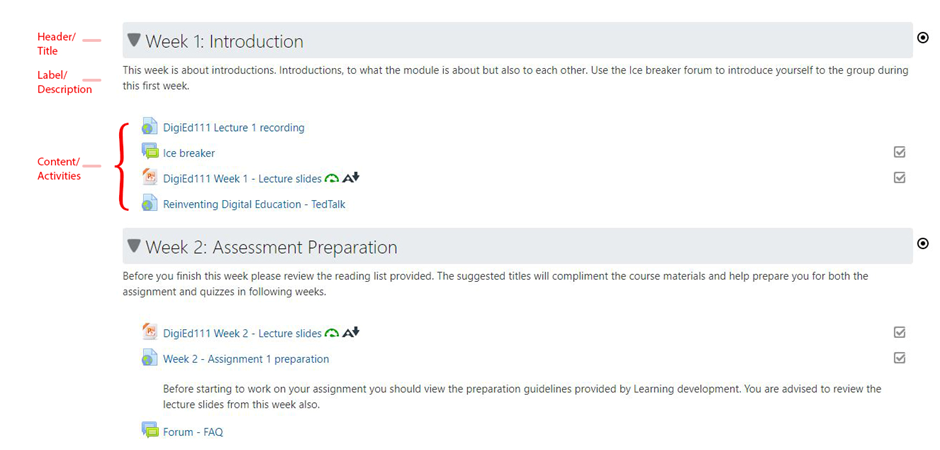
- Maintain a cohesive layout (Header, Label/Description, and activities) helps ensure same user experience and course flow, to create a familiar pattern for your learners. Therefore, as much as possible, use similar patterns and formats to structure your course sections.
2. Add opportunities for learner interaction and engagement
Opportunities for interaction with the knowledge content, as well as other learners helps make the learning experience learner-centred. Incorporating activities into Moodle lends itself well for this purpose, as it promotes independent and active learning, and helps prevent cognitive overload.
There are different types of activities available for use within Moodle, such as forums, quizzes, interactive learning objects (e.g. H5P), chatrooms, and polls. Formative assessment is a good way to increase student motivation and provide an awareness of how well a student is progressing or understanding the knowledge, therefore short online quizzes or incorporating questions into H5P activities or Panopto videos can be an excellent option.
It’s important to note that tasks and activities within your course need to be set in a progressive manner to create a learning flow and facilitate immersion, before creating activities on the fly, it’s important to consult your Learning Design and how activities fit within your overall structure.
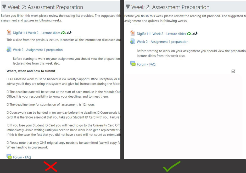
3. Keep it simple, less is often more
Moodle courses should be landing pages for your course content (resources and activities). They are therefore not to be seen as traditional webpages with streams and streams of content. The helps student navigate what can sometimes be vast amounts of content.
Tips to consider:
- Avoid duplicating content/information. Often, staff will feel the need to repeat the name of the module in the welcome title (e.g. Welcome to the module [Title of course]) and then peat it again in the description underneath, when all the time it’s in the title of the page. This just creates needless scrolling to get to the important course content below. Repeating the same information at different points on your Moodle page adds up to make your course layout tedious to engage with.
- Be intentional, make everything in your course have a purpose. If it’s something your students need to only be told once, like a welcome message, it’s probably better behind a ‘click’ rather than always at the top displaying 2 or 3 paragraphs.
- Be intentional with Moodle Blocks. Although there are many Blocks available on Moodle, add only those which are relevant to your course and content. Ensure any irrelevant blocks are removed, this creates less cluttered Moodle courses and makes it easier for students to find what they’re looking for.
4. Enrich content with multimedia resources
Graphics and multimedia can transform boring and sometimes difficult to follow navigational elements into a process that looks attractive and that is easier to follow. Make wise choices however to ensure that images or multimedia resources add value to the learners’ experience or decide whether they’re just getting in the way.
Ensure the size of images or videos used across the course are consistent. If embedding videos from YouTube, they are usually inserted at a width of 560px, so try to making images the same, for the sake of consistency and balance. Be mindful that large images will make learners scroll unnecessarily and using too many will make navigation tedious for them.
5. Create accessible content
Backed by the Public Sector Bodies (Websites and Mobile Applications) (No. 2) Accessibility Regulations 2018, accessibility is centred on ensuring that digital learning platforms and resources can be optimally utilised by as many people as possible.
This includes those with:
- impaired vision
- motor difficulties
- cognitive impairments or learning disabilities
- deafness or impaired hearing
Tips to consider:
- The use of multimedia resources helps ensure that the needs of all learners are effectively taken care of.
- Include descriptions/captions to resources (images, videos, audio files).
- Ensure that all uploaded text material can be read with a screen reader (Note: Scanned images of books, articles are not always readable).
- Use formats with legible fonts, high contrast, and basic colours for your learning resources.
You can review the accessibility of your Moodle courses using Ally. Ally is an accessibility tool which integrates into all Moodle courses. It works seamlessly to gauge the accessibility of your content.