When smartphones first appeared on the market, it was all about making them as small as possible, allowing them to be easily carried with one hand and fit in any pocket or bag. However over the last few years companies seem to have focused on making the thickness of the device thinner but the screens have gradually become larger. And now the new iPhone 6 plus has been released with a 5.5″ screen, what impact could this make on usability? And what will mobile app developers and designers have to do to cope with this change?
The main issue with usability (apart form trying to hold a larger device with one hand without dropping it) is the new larger screen sizes do not allow for average thumb sizes. Research (from 2013) shows that almost 50% of smartphone users use them one handed, navigating primarily with their thumb.
See the image below which highlights the average thumb size based on height…note that this is for the smaller iPhone 6! (screen size 4.7″):

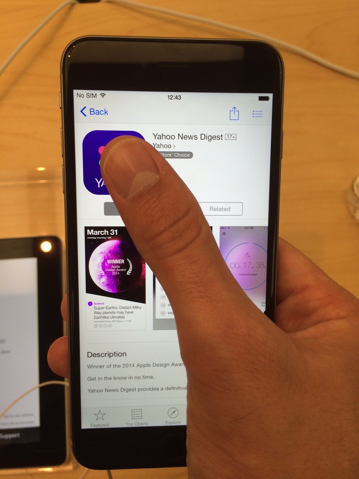
During a recent visit to the Apple store I had a play with an iPhone 6 plus. I was quite concerned how difficult it was to reach important buttons to simply navigate many apps (bear in mind I’m 6ft 4″). I found myself trying to shuffle my hand around the edge and up the phone to reach the Back button. I can imagine doing this whilst walking and texting, checking email etc and dropping it. Trying to reach this button felt awkward.
Of course, there are larger Android phones too so this issue doesn’t only apply to iPhones.
A solution to this for iOS users is called ‘Reachability‘. Android also have apps that offer a similar feature. This makes the screen smaller, roughly 2/3 the original size, allowing you to use the device one handed and so now able to reach those top navigation buttons.
I see this as a cheap fix and quite frankly rather absurd. Why buy a larger device with a larger screen if you can’t/won’t make us of it as designed? Of course you may not need to make use of this feature all of the time. But have a look at your smartphone, look at a few random apps. How many of them have some form of navigation or important actionable button right at the top?
But then again maybe its just a temporary solution…at least until developers catch up and develop a more uniformed approach to resolve this whilst having content displaying as they should be, 100% width, 100% height.
Obviously, this shift in design won’t happen overnight. But it seems Apple have started, somewhat subtly, changing key navigational buttons to suit these larger devices…
Notice the menu icon top right of the app in the above picture, now see where it is in the new Tips app released to iOS 8 users…
If this sort of UI change was suddenly rolled out to all apps in one go, it would likely cause a major backlash. As people generally don’t like changes like this, even when its usually for the better. But possibly by releasing these apps with a new layout, users will gradually feel comfortable with it. And who knows, by iOS 9 or 10 we might see it implemented across the board?
Unfortunately this still goes against the grain of how we expect to navigate. Websites for example always have navigation at the top. Research has proven that when a user first looks at something new on screen, they look from top and to the left and scan towards the right and down…just like reading.
If you read through Apple’s iOS Human Interface Guidelines, they highlight this:

Image reference: developer.apple.com
Of course using gestures such as swiping left/right from the edge of the screen is widely used as a navigational aid. This can allow the user to move forward and back a page within an app instead of using the back button (which could be right in the top corner, and out of reach on these larger devices). e.g. Mobile Safari, Mail app, Twitter. But this is not exactly intuitive to new and infrequent users so cannot be relied upon for the issues raised here. Device features like Reachability certainly helps, but I’d worry how often I’d be using this before purchasing any smartphone this size.
So like when responsive design became the go to thing for web development (as well as app development) and retina kicked into action. Designers and developers had to rethink to best suit the user experience; app developers will have to gradually and carefully develop a new standard for UI design to suit the vast range of big and small smartphones. Either a separate solution that suits just larger devices (unlikely in my opinion), or one that suits all devices with minimum hassle. Users will no doubt adapt to the gradual change of navigating on their larger mobile devices, hopefully with buttons that are within reach and possibly relying more on gestures that become more intuitive as the mobile market matures further.
Excuse me while I make UI design changes to my current project…
2 responses to “What impact might bigger smartphones have on usability and its potential impact on UI design”
So if nearly 50% use thumbs that means more than 50% use one or more fingers?
Perhaps worth mentioning some of the plusses of phones getting bigger, such as starting to become more accessible to older people who cannot use the smal screen smart phones as the typeface is too small to see, and whose hand-eye coordination is not good enough to hit the ‘buttons’. These two factors are why I, as an older user, just use a tablet and am looking forward to smart phones big enough for me to be able to use effectively..
The data from the link showed a combined figure of 50% for one handed users and cradled usage (holding with one hand but using the other hand for input). Two handed was only 15%. This data was in 2013, so quite some time ago knowing how quickly technology moves, current data could be quite different.
It would be interesting to see some data from a more recent study to include these larger devices. I’m sure you’ll likely see at least a slight increase in users either cradling or using them two handed.
You have raised valid points for looking at the positives of larger devices. These larger devices will no doubt cause a bit of a shake-up for design and accessibility. Smaller devices already allow for increasing font sizes(1) and more obvious button styles (2), which is great but there is always room for improvement.
I would definitely like to follow up from this post as you mention highlighting positive changes because of these large devices for users such as yourself that are usually put off by the smaller screen sizes.
1 http://support.apple.com/en-us/HT202828
2 http://www.imore.com/how-enable-button-shapes-visual-accessibility-iphone-and-ipad