— This post was written by Elizabeth Seymour —
After the Ebola Community Project was given it’s official name iCARE (Infection Prevention Control and Ebola Resilience Education) I was asked to come up with some designs for a logo.
Step 1: Sketch out ideas
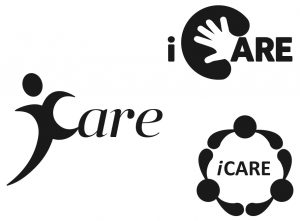
I began by doing a few sketches with pencil and paper, and then vectored up my three favourite in illustrator. As you can see, I always find it best to begin logo designs in black and white to make it easier to finalise the iconography with the client without the added distractions of typeface/colour scheme.
In the first design, I was trying to go for a message which centred on the person, to make the brand and product more human. The second one I used a hand icon which seems to be pretty universal for “care” and in the final design I tried to focus more on the community aspect of the project with three people holding hands.
The project stakeholders chose the third option, partly because they liked the community focus, but also as it had the best “square” shape to fit into an app icon etc.
Step 2: Finalise design
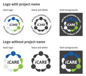
I then worked it up into a more finished design with colours and typeface. I chose the free font “ASAP” as I liked the clear legibility of it and the slight roundness to the characters to me also recalled comic book text without being too informal. I made a version with the name of the project surrounding the logo icon, and one without for differing use-cases.
The other major decision I made was to use the colour scheme from the Sierra Leone flag, something which our contacts in Masanga had identified as a good colour scheme to work with in the communities.
For this stage, I demonstrated how both my logo variants worked on a white background, on a dark background, and in black and white.
The stakeholders liked having the two variants of the logo (with and without the project name around it), but did not think that the pale grey colour showed up well enough on a white background.
Step 3: Responding the feedback
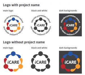
After this feedback I considered carefully which colours to use. I could quite easily swap out the pale grey for a different colour, but without all three colours of the Sierra Leone flag present, I wasn’t sure there was much point in using just two.
I therefore started from a different view point and recoloured the whole icon. I thought that I could use the three people in the logo to reflect the three teams involved in the project, PU PSMD, Masanga and THET. I therefore took Peninsula blue, Masanga’s red and the secondary orange colour from THET’s branding (their principle colour is also blue, pretty close to Peninsula’s shade).
The stakeholders liked this design and so signed it off, so keep your eyes open for it popping up again in the near future!


