I have written this blog to share my experience in my learning curve with design and layout.
The main thing that set off my search for knowledge in design and layout was from the discovery that my knowledge in this area was lacking and somewhat weak. The knowledge I have gained throughout the years was through copying and working with other people’s designs and not really having any of my own. I didn’t really understand any rules of design; if I liked it I would use it
After digging around for information I found on Linda.com a course called ‘Foundations of Layout .Composition’ by Sean Adams.
Before course
The course talked about different layouts, colours and by using set rules within design it boasted that any developer could produce a pleasing style and a look that uses will enjoy and quoted ‘a successful layout equalled attention!!’.
This was what I needed and wanted! I wanted my RLOs to look outstanding. I only seem to have one way of laying out content, which is, writing on the left, images on the right. However, I’m not planning to change this, as this in reflection seems to be a rule that works for e-learning and this style helps the learner not to be distracted through complicated over designed projects.
The course looked at a range of rules, one of which encountered the balance of squares; and balancing of everything on the page through the use of the different sizes and positions of squares. Another rule was to use a grid style of 3 parts, where you divide the page in to 3, that can be vertically, horizontally or both. I quite like these rules I seem to understand the logic a little better compared to other rules that were shown.
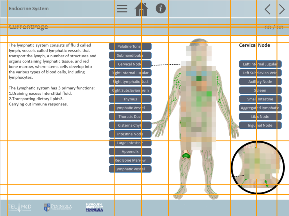
Following the course, I decided to implement the square design rule that I had learnt, to do this I planned to use an RLO that I had started but not got too deep into. At first glance I still liked the way I had laid out the content within the RLO, so an issued I had caused for myself, was to keep the layout, but implement the rule I had learnt.
So I began by adding the internal margins around the content, ensuring that there was equal space on all four sides. I then divided the page in half, both horizontal and vertical. Having set the margins, I moved on to lining up content, the buttons were lined down the middle, so I treated the different sides of the page separately. I have learnt content does play a large part in the design and not all rules can be implemented but if the basic ones are followed then the overall look and feel is still pleasing to the user.


So some months on, I find I still struggle with layout when you have different images that are different sizes throughout the whole RLO.
I have found I ask myself a lot do I keep the images in the top left, centralise or top right?
I like how it looks when the image are aligned top right and I like how the boarder is the same all around the image as seen in image 1, but I also like having all the images sitting in the same place, so when someone works through the RLO, the images don’t move around the pages.


