As hinted in my previous blog post, I’ve been working on a dashboard web app to show iCARE app data captured from Sierra Leonne. I began working on this using a simple Bootstrap template as its super useful for creating fast, responsive grid layouts which work out the box on mobiles to big screens.
I then used Morris.js to create most of the charts that you see in any screenshots in this post. This simplified my task a fair bit, however, I still needed to develop the functionality to get the data, and sort into various objects that the Morris charts expect.
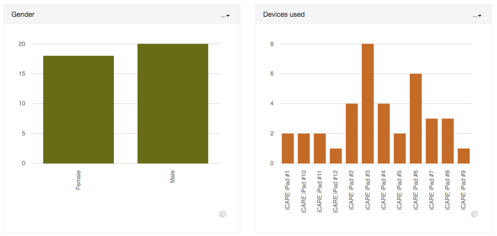
Bar charts
Below is a screenshot of the design for bar charts. Note the colour palette is not set in stone right now. Actually, the colours change each time a chart is loaded. As I was undecided on a few choices so its randomly switching right now to help get a feel for what works well.
I experimented with horizontal bar charts too but it added a layer of complexity in that vertical or horizontal would work better depending on the amount of labels, label length, the length of time the data is spanning and getting then having to automatically size the grid to accommodate all this. It just quickly went beyond the scope for this phase of the project. As I really want the dashboard to eventually be able to allow the user to make ad-hoc changes to position, layout, and size. As its very difficult to program this as the data varies a lot.
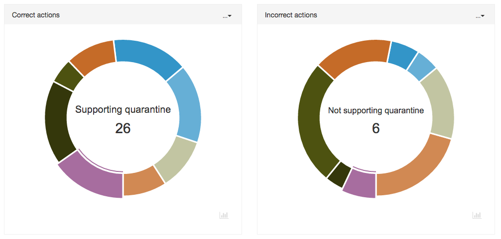
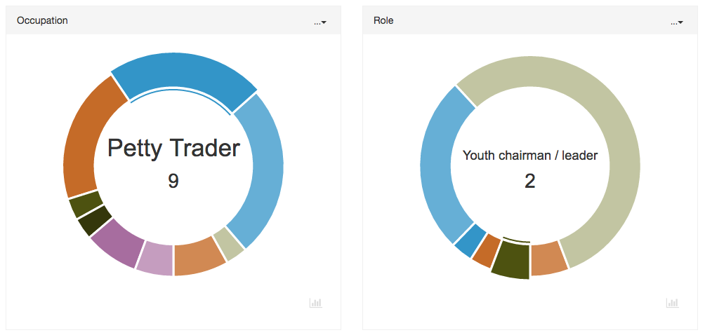
Donut charts
These charts are a basic visualization to see very quickly, which data is prominent (or not). They are interactive in that when selecting a quadrant, the value and amount are shown in the centre.
There is also comparison charts (see screenshot gallery bottom of this post), which allows the user to compare data for correct and incorrect actions (these are pre-defined in the web app and filtered accordingly). Therefore, unlike bar charts where the colours will change, the donut charts will always draw based on a set array of colours which helps visually make any comparisons.
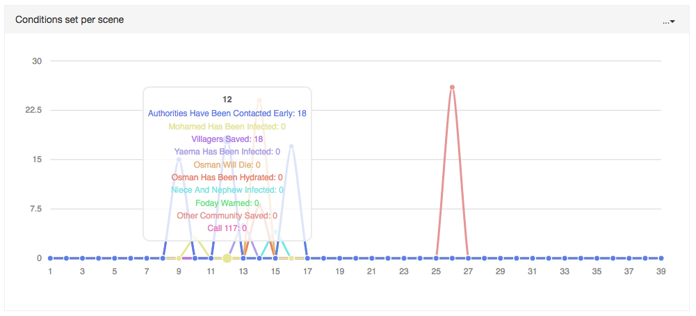
Line charts
The dashboard currently only has one line chart and its data is more of a prototype than anything really useful that could be displayed in a more meaningful way as another chart. However, this was created to show what could be possible for the right data set.
Below shows the amount of conditions set per scene in the app. And a lot of the chart lines are flat as not every scene has an interaction which alters or sets a condition in the story. This could later be automatically filtered. But what is useful to see is that by simply hovering over each day, you can quickly read tallies for each condition that is pre-defined to be filtered and included in this chart.
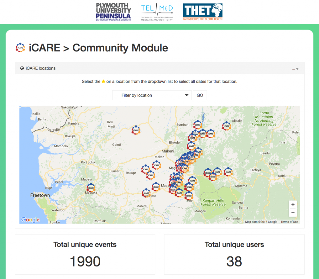
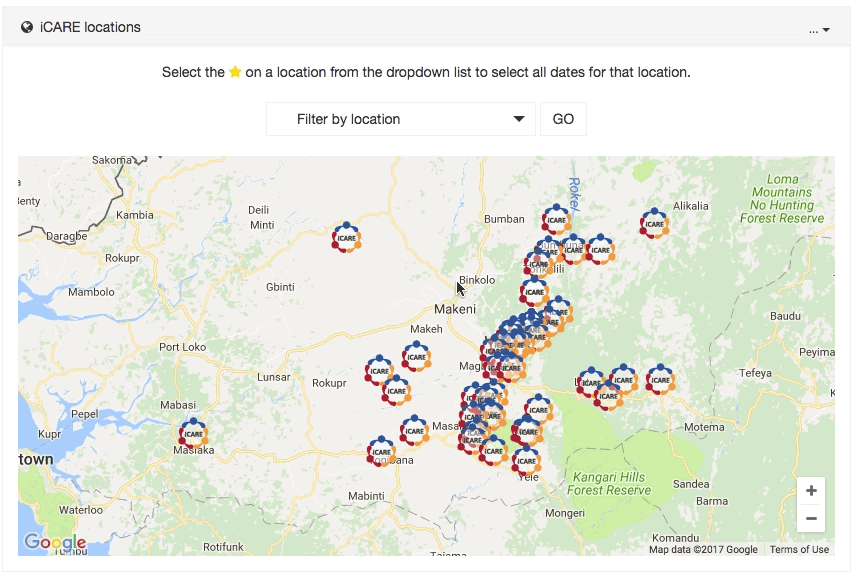
Google map
It was requested that the main way of filtering data in the dashboard was done so via the geolocations where the app was used in Sierra Leonne. I made use of this Google map JS open source plugin to help get started. This very quickly allowed me to create the Google Map with custom icons and locations which are loaded in via AJAX data sent from the server which contains all the location and date data.
Whilst this works well, the issue with integrating Google maps is it’s quite clunky to load in, and you have limited controls to how it does so. Currently, whilst this dashboard does run fine on mobile devices. Using Google maps has made it run noticeably slower to load and run, including whilst scrolling. I need to see if this can be optimised somehow, but for now, its fine and is working well and perfectly on desktops.

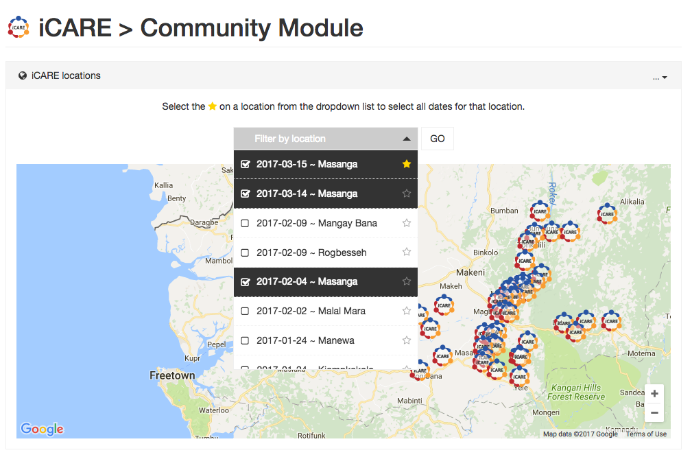
Filtering options
A custom made dropdown selection was developed to accommodate a request to select based on geolocation and date. Data of which is brought in via a database. This dropdown allows for multiple selections as well as star buttons to the right of each location. Selecting this will automatically select all instances of that location to be filtered. For example: selecting the star icon next to one of the Masanga dates will automatically then select all Masanga dates. It works really well and is a nice user experience as it simplifies selecting multiple locations. Even with one location ‘starred’, you can still select and de-select other locations and dates and if you press star next to a different location, the previous locations will be removed and new starred selection highlighted.
Other additions
There are a few other things developed into this web app to make it flexible and useful to the end user. One of those features is the ability to quickly switch graph types between donut and bar charts. As both make use of the same data object, it was just a case of getting the chart’s data via a target ID for that chart, then re-drawing for the new chart type (which will be opposite to what it was before). Works well and benefits users that prefer to view a dataset in more than one way. This is especially useful when viewing data with a lot of points. Sometimes a donut chart is not very easy to read with lots of labels, so switching to a bar chart in this instance makes sense! The web app is designed to be easily editable so the default selection for any chart can be changed. But by allowing the user to make their own choice is a powerful option and something I’d ver much like to make standard for all elements in a dashboard.
Another thing I began working on was offering the ability to let the user change the width of any chart. As bootstrap is being used, its fairly easy to dynamically alter the class name for the target chart and it will responsively re-draw to suit. This was quite easy to achieve, however, the reason it is not quite in place is due to the complexity of then altering charts around it without it looking clunky and a poor user experience. I have a few ideas. Just needs a little time!
What next?
Whilst this version is pretty much complete as is. There’s still plenty that could be done to improve it and make it more useful. As well as this, much effort was made to develop the dashboard in a way that would make it pretty easy to use with other data sources from other projects.
Few of the main things that could be done include:
- Finish ability for the user to change and alter chart widths and layout.
- Allow the user to save their dashboard customisations (either via user registering via database or at least some long term cookie with an option to store in a database for later use).
- Add export options per chart. Export as a CSV or PDF.
- Add the ability for integration of ‘smart graphs’. Where data gets filtered on based on key selections in each chart. E.g. for all days in “Masanga”, filter users that are “male” with the occupation “farmer”.
- Add filtered data to each Google map location. Each location is clickable. Therefore it wouldn’t be too difficult to filter and show data per location. Such as users and events logged as well as average duration to complete the story etc.
Screenshot gallery
The gallery below contains screenshots for how the dashboard looks as of now. The data shown is taken from a development server so this is for demonstration purposes only and not true data.