THE DESIGN
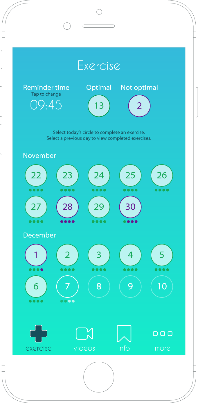
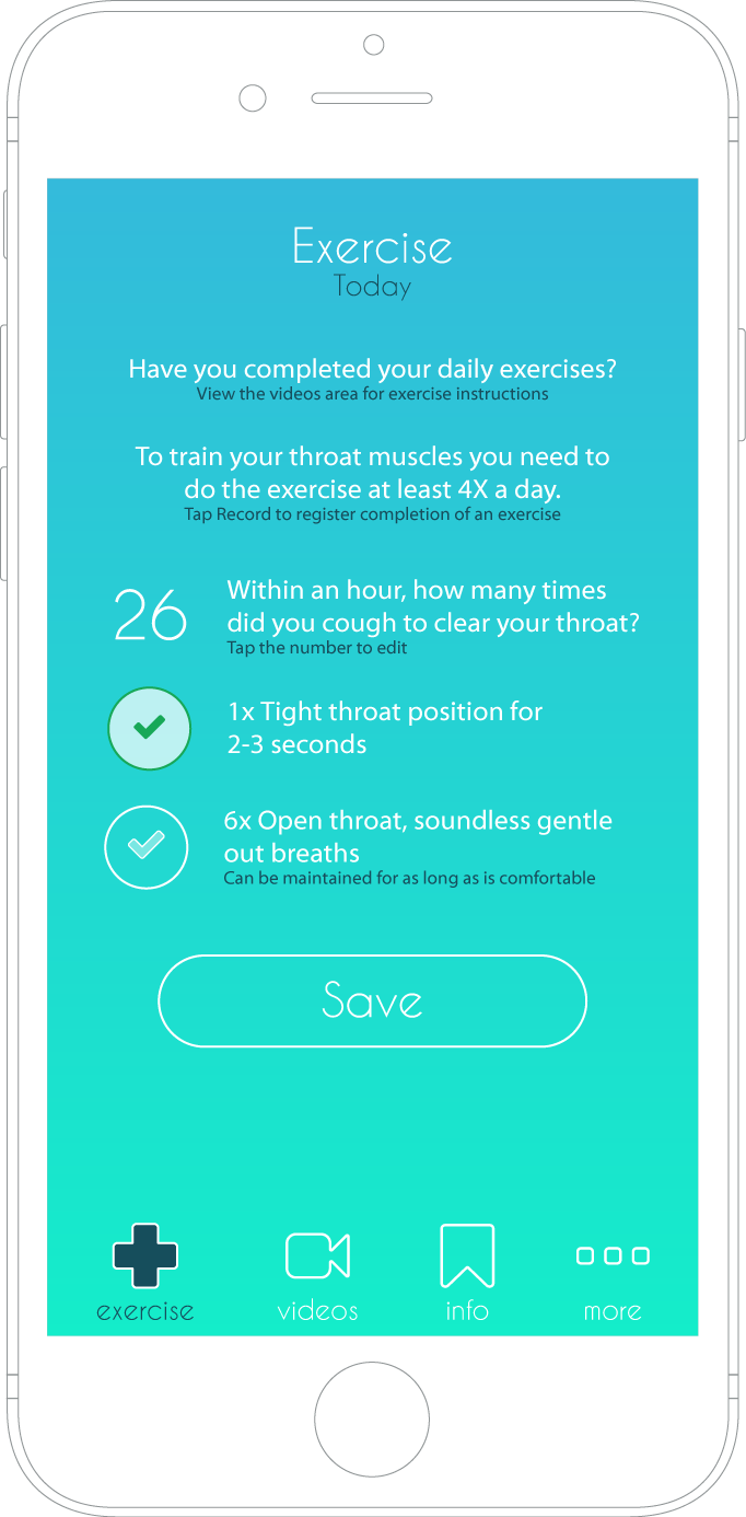
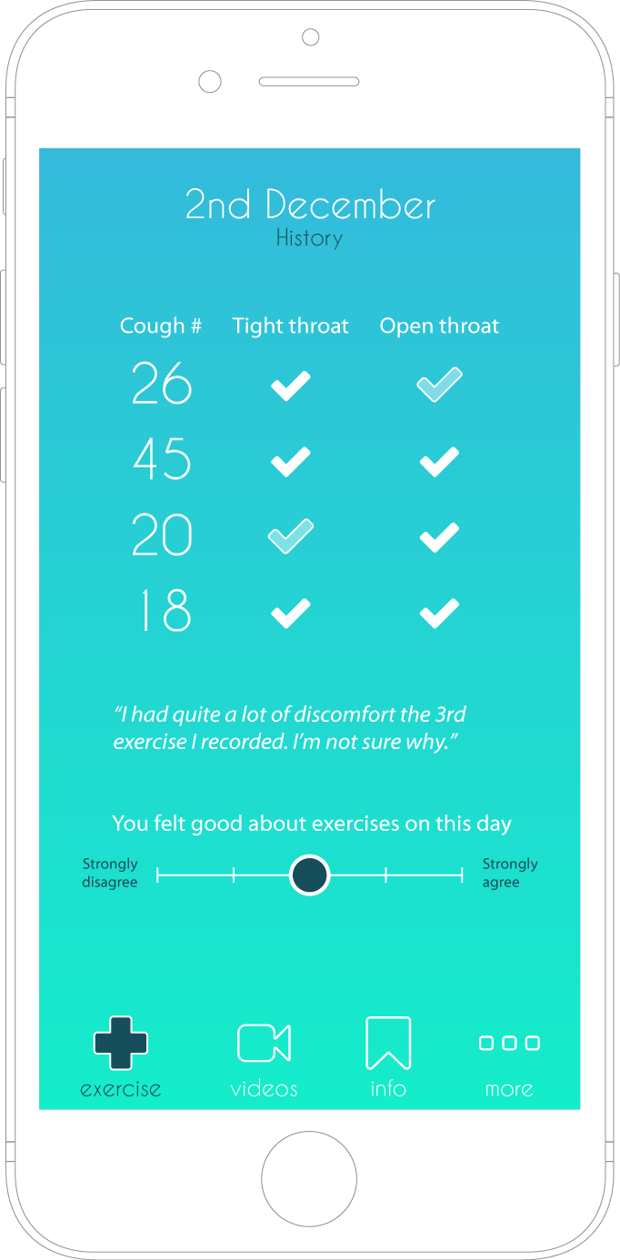
After reviewing the content required for the app, the feature requests and some discussions around who it’s for and how it will be used, I created a few initial draft designs which highlighted how the app will be played out and flow…
Click on a thumbnail to see the full image
The design inspiration for this app was ombre. On face value, ombre is just a gradient with two or more colours. This trend in use of colour is being used more and more frequently in modern web and mobile design to offer a more welcoming look and feel. Like the hue of changeable lighting in a relaxation room! (Could do with one of those in the office!)
Once you’re aware of this design trend, you’ll quickly see it everywhere, such as:
“Ombre was the biggest design trend of 2016”
https://www.ceros.com/blog/gradient-making-comeback/
Many Apple apps use gradients in their design:
https://blog.marvelapp.com/gradients-new-colors/
Lastly, this Pinterest board is interesting in that it shows how ombre was a term initially in the fashion industry, however, as you’ll see, it is being utilised a lot more now in web and mobile designs!
You’ll probably recognise that a lot of ombre inspired designs have gradient backgrounds with a mainly white or accented colours for the UI – depending on the contents’ importance in order to help draw the user’s attention.
This helps keep a consistent contrast that not only looks good but continues to work in black and white or for high contrast enabled mobile devices. This was a slight challenge in the Globus app. You’ll see the contrast of the white text in the footer buttons is not good at low resolutions. Therefore the design was tweaked a little as well as the use of a bolder font and a tweak to the kerning.
Using this style of design seems to help the flow of the branding overall. Simply by drawing from two different colours, the style becomes more memorable and could be recognised when used in any other platforms such as for print.
The app icon was easier to create too!
Android app icon
iOS app icon
THE UI
The design of the layout of the app was purposely created in such a way as to allow it to function and flow similarly on both smartphones and tablets. This was also to create less work when creating things like the main footer navigation. Which generally works better at the bottom for larger devices, even for someone like me with big hands!
Also due to the limited amount of pages the user will require switching to, it was decided to include access to all pages in the footer itself.
All the buttons have been designed to animate slightly when pressed so to show the user that an action has or is about to occur. I’ll be using CSS animations mainly with a few JavaScript animations running for things that require some more complex triggers. But as CSS animations run better on mobile devices, I plan to use that as much as possible.

