Over the last few months we have been working together to create a new template design that we can pull all of our existing Reusable Learning Objects (RLO) into.
Currently, all of the existing RLO’s have been made by different developers, old and new and by placement students and mostly in Flash, some even in AS1!
The results vary as each developer had their own style and way of working.
Although some RLO’s are technically sound, with Apple not supporting Flash, none of these existing RLO’s will work on mobile devices. The plan was to bring them together into a single coherent design that would give us as much space as possible for the RLO to sit in. We also aim to make them work on other devices such as tablets and mobiles.
A secondary challenge to this was that the template would have to work across both Lectora and Storyline as we have staff who use both. Using both tools means we literally have the best of both worlds. The developer then has a choice to use what they think is the better authoring tool for the job.
This brought its own set of limitations as both tools handle certain elements differently. Such as menus. Lectora is the better tool here if you would like a fully custom menu no fuss. Storyline, if you use the built in menu then styles are limited. This means for a completely customised menu you will need to do the whole thing yourself using master slides and layers.
A colleague had already made a decent start prior to me joining the team, and after going through the designs I decided that there was only some colour and font tweaks to make. Layout out wise everything was there.
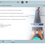
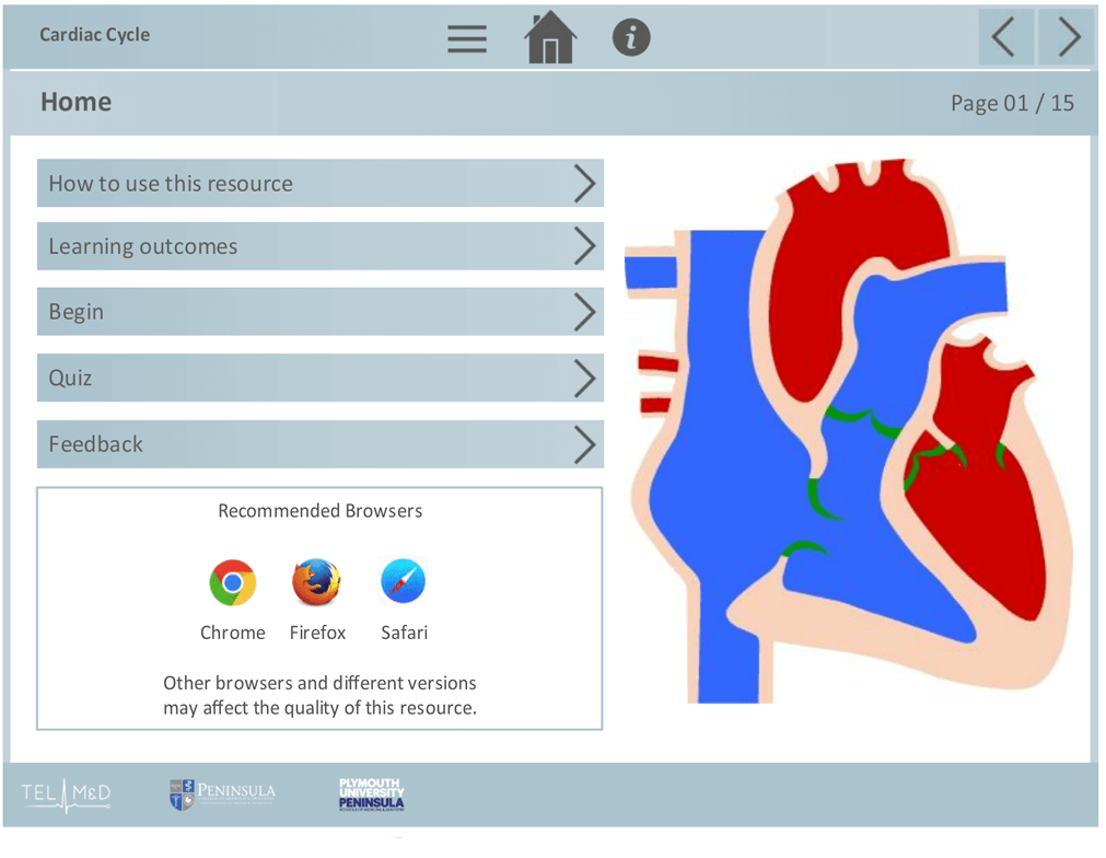
A header and footer is all that is needed for the RLO itself as the main center section is large enough to hold a range of content. I chose against creating lots of individual layouts and templates due to the varying nature of the existing RLO’s. This gave the developer maximum flexibility to redevelop as they see best.
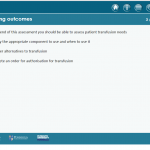
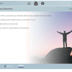
A page on Learning Objectives as well as a Quiz layout was designed. Each RLO now had this minimum standard to abide by.
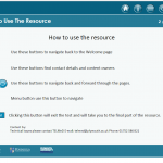
One area I did tweak layout wise was the main buttons. I decided to move them from top left to a more central position. This would allow the navigation buttons to take its place top right.
Now as you are reading this, these templates are being populated with content ready for release in the new year.