Designing an eLearning package can be tricky. Especially when you first start out. You want to aim for a consistency across multiple packages so frequent users do not need to re-learn how to use something new each time. So its good to create a sort of template when starting, this will speed up future developments. By covering the topics of design listed below, you can carefully craft something that is modern, engaging and generally pleasant to use. We want the users to focus on the content after all!
Colour
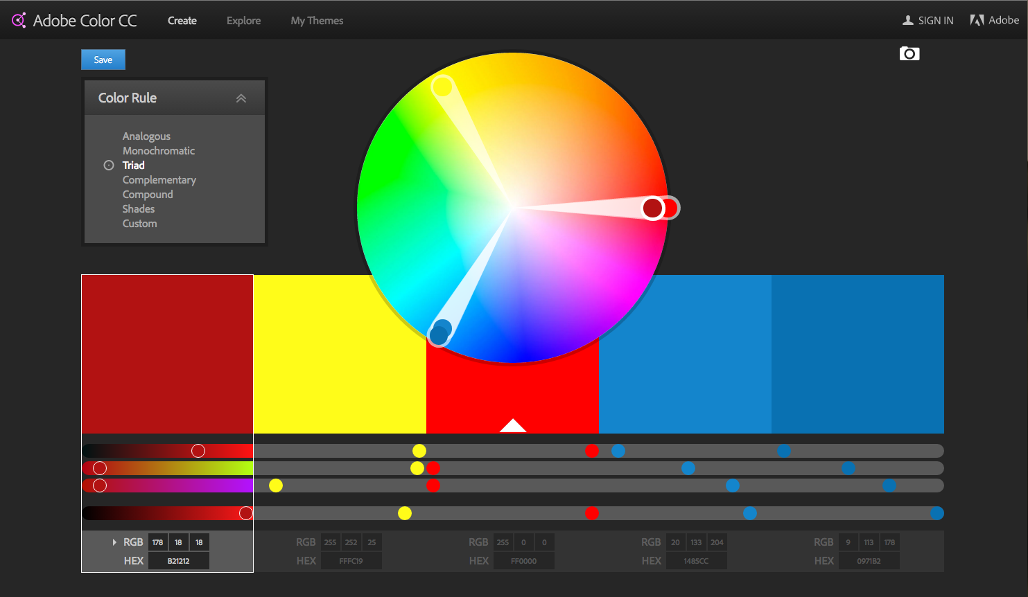
Using a good colour palette is important. Look around major websites and look at their use of colour. Notice anything? You’ll see that most employ a palette of 2-3 key colours. Anything beyond that are generally shades of those colours that compliment the main palette depending on the type of action they achieve (e.g. web link, save, edit and purchase buttons). All colours can be categorised to a particular meaning, and you should carefully consider these before designing something.
If (like me) your sometimes unsure of “colours that go”, there are some great tools out there that are free. Such as Adobe’s Colour app “Adobe Color CC” (previously Adobe Kuler). This easy to use app can be used on desktop of mobile devices. You can upload an image to it and let it create a colour palette for you or you can manually choose colours from it. From there you can take the hex and RGB values from it to use in your designs. Easy!
 Contrast
Building a good flow into your designs are important. And providing a good contrast in key areas help the user quickly negotiate things like navigation and call to action buttons required to proceed. An example would be a disabled button could have a mid grey background colour overlaying a white background when the user has yet to answer a question or complete a task. Then it would turn green once the user has completed the task and is ready to proceed. The use of contrast here dictates to the user without having to create extra text explaining what they need to do.
An example of where this type of scenario could go wrong however is when designers implement a background image that is quite busy. Having a button overlaying this image could easily be missed by a user… unless careful consideration is used in the contrast between the button and the image with a good use of colour.
For more information about the importance of good contrast for more than just aesthetic purposes, as I haven’t even talked about accessibility yet!… see this article from Smashing Magazine.
Repetition
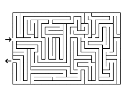 Avoid the above!
Using any eLearning package shouldn’t be a maze. We’ve all probably been on at least a few websites that you get completely lost on, forcing you to frantically click the back button. It shouldn’t be a puzzle to get to where you want as this leads to frustration to the user that has just come to learn and engage. And one of the key factors to this is repetition. All of the elements in this list (colour to balance) require repetition. So things like, font sizes, styles, colours, paddings, margins, navigation, headers and footers should all be consistent for each page your user visits. Allowing them to be able to fully commit to learning.
Style
Style is like art, in that its a very personal choice. Everyone has their own opinions of style. With this brings challenges we face as designers to give them confidence that this eLearning tool is current (cool if it has to be!), and is appealing. Imagine using something designed like an old 90’s website… would you trust its content to be current and up to date? Creating a good style should come naturally by utilising the other elements discussed in this blog post. But if your not sure how to design something, don’t just throw the kitchen sink at it! As over styling is a thing, and not in a good way!
Alignment
This coincides overlaps (ironically) with repetition and balance in that alignment is important to create an overall sense of style. Good alignment can allow elements on a page to breath, to have their own space in such a way that it doesn’t look out of place. Remember that alignment applies to everything your user looks at!
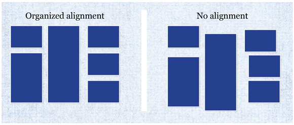
Image from url: http://tympanus.net/codrops/2012/06/19/line-that-up-proper-alignment-in-web-design/
Balance
When trying to create a balance, try to layout elements in such a way that creates a flow. Depending on the contrast and alignment of objects, users generally instinctively look from top to bottom, left to right. Bare this in mind when balancing content within your eLearning package. Thats not to say to centrally align text 100% width and have text, image, text image! You could make it more interesting by narrowing the width of the text to 60% and then adding a few smaller images on the right taking up the remaining space with some padding and white space thrown in (don’t forget the white space! Its like dark matter, you don’t really notice it but know its there and its important too – so I’m told).
A good example of balancing multiple elements on a page: http://unboundwebsitecreations.com/7-elements-for-a-balanced-page-layout/
There is no hard an fast rule to successfully creating a well designed eLearning package, but by following the above guidance and techniques, you soon understand why other good looking materials, websites and apps look aesthetically pleasing. And thus able to replicate that vibe on your designs. For extra inspiration I recommend using Pinterest and search something like web inspiration or colour palette inspiration etc.
Next blog post in this series: 2/5 Add meaningful interactions
Or choose from this series:
1/5 Build a compelling visual experience
2/5 Add meaningful interactions
4/5 Engage more users with video